Thursday, 18 November 2010
Mutton Quad.
Mutton Quad-(working title) is a live brief set by ISTD to design a typographic restaurant. I think this project is great because I feel there's potential to go on tangents as typography is a medium of communication and interaction, but also it can easily be reeled in to answer the brief. My initial thoughts of the brief is to interpret the meaning of languages, phonetics and the interaction of words.
Monday, 18 October 2010
Static in its Preliminary stages.


Visuals responding to the word Static. On-going project that needs bridging together.
Friday, 8 October 2010


Saturday, 11 September 2010
*Correction 'Gunslinger' is replacing 'Desperado'
Gunslinger: gun'sling'ing n. - a gunfighter or gunman, esp in the Old West.
one who is armed with a gun, especially an outlaw.
one who is armed with a gun, especially an outlaw.
Wednesday, 8 September 2010
'Desperado' Summer Project.
As a way to ease us in to our final year of University (terrifying thought) we have been asked to promote our very own 'Arthouse' for D&AD film night. Immediately I knew American western films would be fantastic genre to work with because in every point of our lives we go through a phase of playing Cowboys and Indians (Hero vs. Villan). Also 50 years ago, Westerns was the only form of entertainment and as a result; produced many mesmerising films. I've gone with 'Desperado' for a title which basically means bandit/outlaw and this theme connects my chosen 4 films: Butch Cassidy and the Sundance Kid, The assassination of Jesse James, High noon and 3:10 to Yuma. Now it's time to crack on and get creative!
Thursday, 12 August 2010
Wagamama 'Cookout'.
-poster

-bag

-packaging boxes


Brief set to us by a design agency called ‘Dinosaur’. "To design new packaging for the chain-restaurant Wagamama". I wanted to experience a different concept of designing and keep to strict guidelines. As a regular customer, I enjoy the whole Wagamama experience including its atmosphere and the style of food. With my concept I have gone with the notion of chopsticks playing a pivotal role and misplacing letters; encouraging some playfulness with Japanese food.
Wednesday, 4 August 2010


Ghost Signs.

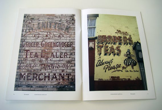

Best known as 'ghost signs' because of their faded appearance. Glimpse of these old painted adverts were once strong advertisements to local dairies, bakers and laundries.
http://www.creativereview.co.uk/cr-blog/2010/july/made-by-cows-written-by-chi-drawn-by-carmichael-and-slater
Monday, 2 August 2010
Sunday, 4 July 2010
Stonewall. A campaign to encourage people to use their vote!


Stonewall campaign designed to involve British citizens to use their vote and change Britain. The concept is based on the notion of 1 individual can make a difference and by replacing numbers with letters strengthens this idea. I thought simple, historic text portrays a trustworthy and well-established political party. Blue and Red reinforces a British campaign!
'100'. Myths based on Robin Hood and the significance of 100.
Paying homage to Robin Hood and the ‘100th’ arrow slaughtering Prince John’s hart.


Paying homage to Robin Hood and the 100 trees in Sherwood Forest.


In response to an 'ISTD' competition brief; I researched Robin Hood and the significance of '100'. Being born in Nottingham, I have grown up with the legendary outlaw and the tales told about him. Although I've found this project to be the most difficult, at the same time the final outcomes have been rewarding! One area I particularly enjoyed was researching Robin Hood in the Special Collections in MMU's library. The whole process of searching historical books and studying incredible drawing from various illustrations really brings Robin Hood the legend to flesh. Both outcomes pay tribute to aspects associated with Robin Hood and his heroic tales. Through imagery I layered illustrations to depict the vast information and myths based on Robin Hood but aswell show a consistent theme.
'FLOCKAGE'. Nostalgic Wallpaper.

This wallpaper design is a concept based on two elements of merging childhood memories and time spent with families. Dinner plates often change over periods of time during the same time as families do. Despite change, families remain as they are and keep to a mundane routine when everyone comes together for one part of the day. Meals often evoke memories of our childhood that are triggered by either smell or imagery. Finally, as time goes by the memories begin to deteriorate, as space is needed to create new ones. This idea re-enforces a notion of the memory existing but losing its stability as you focus in.
Don't Judge a Book by its Cover. Series of New 'Futureshock' Book Designs.


The brief was to design a new series of 'Futureshock' books aimed to encourage young adults to read. My approach to this project was to use photography as a medium and design covers to leave the reader with thought-provoking responses and questions that could only be answered within the book. I am very proud with my end result for all of my book covers and most of all how effective they look as a collection.
The Train Standing at Platform Two. Collaboration brief to produce a metaphorical Journey.


Collaboration was a brief set to us to work in groups and present our final outcome to a panel, in a style of “Dragons’ Den”. This project was a typographic brief based on taking metaphorical journeys on the theme of connections. Each of us had a book to work on that would reflect an age group’s attitudes and imagination.
'KMISTRY'. Corporate Identity.

Corporate Identity is a brief set to us to design an identity for a client. I created an identity in a chemistry manner and researched polygon formulas. As a designer, it’s not often you get to research polygon formulas in chemistry books; it’s that concept of having fun and making the most of eccentric concepts.
Disruption.


'Disruption’ project was the most open minded yet challenging brief; outcome was to visually respond to a piece of music and produce something distinctive. The strongest aspect of my experimentation pieces was my photography of Mr. K. Based upon the notion of Mr. K takes form as a Kellogg’s cornflake at ten to six. an unorthodox approach but worth a risk but it was a vital step I had to endure to realise that any form of connection can be made from words to create visual responsive that reflects you as a diverse individual.
Friday, 2 July 2010
Wednesday, 16 June 2010
Restriction. Series of layout designs interpreting the word 'Belief'.
500 words

50 words

10 words

1 word

The project was given to us with restricted guidelines: Helvetica typeface, 2 colours and a limited word count for all pages.
Each layout design is paying homage to old wives' tales and how they are applied to modern day life, but also how these urban myths control our actions and entail the consequences if broken. Although people believe it's all superstition and tales told have bent the truth as they have been passed down by generations, yet we still lack the confidence to ignore these tales and it seems 'safer' to believe in them.
Subscribe to:
Posts (Atom)